Saturday, February 25, 2017

Background and Quilting of the Background - a lesson learned

   After all the parts that make up the "Tough Old Bird (TOB)" were painted, I assembled them on a piece of tan fabric. This fabric prevents the background colors from coming through the lighter fabrics. I trimmed the tan fabric up to the edge of the TOB, so none of it shows. It just adds a nice warm tone and prevents color bleed through. I do this with all of my portrait images.

I used a blue and brown background, as you can see in the image above. I pieced the background and sandwiched it. I decided to quilt the background before putting the TOB on it. I used a straight stitch for the quilting on most of the background.


After completing the straight stitching, I placed the TOB on the background. I fused it down and then machine quilted it. As I was looking at it during the quilting stage, I realized I could see the straight stitches on the background fabric through the TOB. Pre-stitching the background turned out to be a mistake. I had straight horizontal shadow lines all over this old dude, and that was not what I wanted. I didn't like the way that looked at all, so used a stitch picker and removed all of the straight stitches that were under TOB. It was extra work but worth it.

So what went wrong? The horizontal lines may not have shown through if I didn't use fusible behind TOB, but I like fusible and I'm going to use it, I got the idea to stitch the entire background first from another art quilter. She says she does it and it makes squaring up the quilt at the end easier. She does not use fusible, so that may be why it works for her. Since I use fusible, I won't pre-stitch the background again.

It was a lesson learned, but all is well in the end. In my upcoming posts I'll show more of the quilting and finishing of this piece.

Thanks for visiting my blog!


Saturday, February 18, 2017

Skin tone, and hair for Roy

  This piece required painting skin tone for the face and arm/hand. I painted the face, head, beard and glasses on the same single fabric piece. The arm, hand and cigar were done on a separate piece.

My preferred colors for Caucasian skin tones are yellows, browns and pink/red tones. The shadow areas are created with blues or blues mixed with reds.

Here are some in progress photos:

    Arm and hand...


and here is the face and neck.


In progress stages often aren't pretty. You just have to have faith and keep going, knowing once you get the value contrast in it will look better. Practice, practice, practice.

  This photo shows my painting palette while I was doing these pieces.


  Here is a practice piece for the glasses. I thought the reflection and eye shadows would be a little tricky, so I did a test painting first.


    The hair and beard can be seen here.  A lot of white, gray, silver and blue were used to get the look of the hair and beard.

Thanks for visiting my blog!


Saturday, February 11, 2017

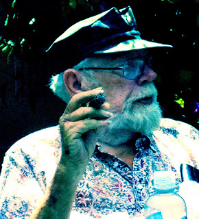
Hawaiian Shirt


Roy is wearing a Hawaiian shirt in this picture, and he has a cigar case in his pocket. To recreate that look in fabric I started with a white-on-white fabric. I laid the fabric over my line drawing and penned in the light, medium and dark value areas. I used a Frixion pen for these lines so they would easily erase with an iron. I show the fabric below with the lines. I enhanced the color of the photo so that you could see the white on white pattern.


White on white fabric is very interesting when painted. The surface white design takes the color different from the background fabric, so it shows the white on white design more prominently.

I mixed together blues, pink-reds, and other colors in the shirt and started to paint away. I didn't paint areas that would be covered by the arm or other parts. Here is an in-progress photo:


The cigar case was made using the same green fabric I used for the hat.

Here is a photo of the shirt after the painting was completed:


Thanks for visiting my blog!


Saturday, February 4, 2017

Marine Hat


This post is about the hat on my "Tough Old Bird" piece. As you can see, Roy is wearing a dark hat. It is actually a Marine hat, dark green with a gold emblem in the center front. The value contrast in the photo is very interesting to look at, so it's an important part of the ensemble.  I always start with an enlarged line drawing of my subject, and that is what I am showing below.


I outlined the light areas on the hat on the line diagram to make it easier to paint later.

I chose a commercial green fabric as the base for the hat. I placed the line drawing on a light pad, and laid the green fabric over the line drawing. Using a white chalk pencil, I traced the hat outline and marked the light value areas as well.

The green fabric is lighter than the hat color, so I mixed a darker green ink with aloe vera gel and applied it to the darkest areas on the hat. The lighter areas on the hat were made by painting the area with an aloe vera gel mixture of white ink mixed with some green ink. These photos show the hat in progress.


A few paint layers later, getting darker with each layer, I ended up with the hat shown below. I added gold paint to the emblem at a later stage to make it stand out a bit more. 


Thanks for visiting my blog!