Tuesday, June 30, 2015

Urban Graffiti - "The Krew"

This post is about my Urban Graffiti art quilt.  I've decided to call it "The Krew". I understand that "krew" is the name and spelling that taggers use. So that's what I'm calling it.

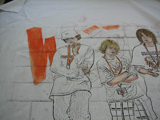
My last post was about painting the clothes. Today I'm going to talk about painting the wall, graffiti and ground surface.

For the graffiti I used an orange Jacquard textile paint.


 I put it on in a way to make the strokes visible and going in different directions, or to leave bits of white fabric showing through.


The three dimensional part of the letters was painted dark blue. I used inks for that area.


 I outlined the letters with black or dark blue pens and paint.


The ground surface was painted in the same ochre that I used for the clothes.  I mixed some white with the ochre to give lighter value areas. Likewise I added shading around the shoes for depth.


After the lettering was done I painted the wall behind it. I selected a gray color. The gray paint I used was an ink. I mixed it with aloe-vera gel and white opaque Setacolor paint to lighten the value of it.  Here is the wall color:


I left some of the white showing through to give a mottled appearance.


You can see the overall look in these last two photos. Now its on to the quilting stage!

Thanks for visiting my blog!


Wednesday, June 24, 2015

On to the Clothes


before painting the clothes

They look kind of stark without color in their clothes, don't they?

To paint the clothes I start off with a lighter to medium value of the color I want the clothes to be. While the paint is still wet I will wipe out the lightest value areas to remove some of the paint. That helps to give you highlights and a three dimensional look. Once the light and medium values are painted I put in darker values in the shaded areas. For the darker values I mix dark blue and/or black with the paint color. The last step is to go back and add some highlights using white mixed with the color of the clothes. I used Jacquard paints for most of the clothes.  

Here you can see a green shirt painted with medium values and the lighter areas wiped out.


To the left you what it looks like with some of the shading added. It really starts to give it a three dimensional look.


Here is a photo of shorts that gives a good example of the importance of shading:


As always, thanks for visiting my blog!


Friday, June 19, 2015

Painting Hair


Next steps for “Urban Graffiti” piece: the hair

Most of the kids have brown hair, with the exception of one blondy in the group. I painted the blond hair first, because I knew I needed to put blond highlights on the brown hair before I put in the darker values.

blond hair


For the blond hair I used mixtures of white and yellow ochre, some lighter and some medium values. Browns were used in the darker areas of the blond hair for shadow areas and depth.

brown hair


I mixed brown hair color from the flesh tones and some other darker/reddish colors and made various shades of brown hair. The autumn leaf color used in the flesh tones helped to make the browns richer looking. I tried to make sure there were highlights and loose ends sticking out from the hats so it didn’t look like a helmet.

On to the clothes...

Thanks for visiting my blog!


Friday, June 12, 2015

Painting Flesh Tones


The Urban Graffiti piece has five kids in it, and its time to paint them!  I'm starting with the skin tones.

For Caucasian skin tones I mix together the following Tsukeniko inks: 

95 Tuscan Beige
53 Autumn Leaf
92 Red Delicious
18 Ultramarine

inks used for fleshtones


I do a few different mixtures, some with light values, some with more reddish tones, some with more brown tones. It all depends on the coloring of the person and the lighting or shadows. 

I apply the mixtures going from light to medium values. For dark values/shadows I mix the medium reddish colors with dark blues. 

Here are some pictures of the painting of the flesh tones in progress.

fleshtones

flesh tones


blue used in shadow areas


To add some fine line details around the eyes, lips and nose I used a black micron pen. I got that tip from Deborah Stanley (thanks Deborah!)

micron pen details


.


Thanks for visiting my blog!

Friday, June 5, 2015

Urban Graffiti - The Color Plan

I'm not usually a "fly by the seat of my pants" person, and like to know where I am going before I start. So I almost always have a color guide that I use before I paint.

I photocopied the line drawing of the kids and printed it several times on copier paper. I then used water color paints to try out some color variations. I needed to change the color of the clothes for some of the kids to unify the painting. I also thought the clothes were a little dark. I was aiming for a more colorful appearance to this piece.

Here are some of the color plans:


They are messy, for sure. I am not trying to do a piece of art with these, just get an idea of the overall color appearance. 


This is the color plan I am tentatively settling on:


I’m still not completely sold on some of the clothing colors, but its a place to start. I'll paint in the colors that I know I like first and probably make some changes after I see it on the fabric. 

Thanks for visiting my blog!