Thursday, May 30, 2013

A Slice of the OC - working on the buildings

The photo to the right shows the general layout of this reduced version of my Orange County city scape. I have numbered the buildings (the pink pieces of paper have numbers on them) and then photographed the layout with the numbers showing so I can figure out where the building goes when I remove it from the background fabric. I had a print out of this photo next to my work table and I relied on it quite a bit as I worked on the buildings.


My next step is to add some details to the buildings. I like to have the edge of the building that faces the front stitched so that it stands out and gives more definition to the building shape. I placed the buildings on stabilizer, as shown below. Then I stitched along the building edge lines. I used a straight stitch and went back and forth about 3 times on each line to make it stand out. I also chose a color for the stitching that contrasted and was part of my color palette for this piece. The next step is to tear or cut off the stabilizer paper and put the building back in place.

I also like to add some shading to the side of the building that is in shadow. I decided the sun was coming from the right, and used oil pastels to add a shading color to the building sides. I pressed the building between paper with an iron to blot/melt away the wax in the oil pastels. I had to reapply the oil pastel in some cases, but I find it is better to apply lightly and build up to a stronger color.  You can see the shading on the brown buildings in the lower photo.  It gives a subtle effect and adds some dimensionality, I think.  I choses oil pastels for this because I am going to be teaching this in a workshop and wanted to use materials that are inexpensive and readily available to the students. I prefer inks for this type of shading normally.

Next blog post will show the trims that I used.

Thanks for visiting my blog!


Friday, May 24, 2013

Color Plan for "A Slice of the OC"

 I like to use fabrics in city-scapes that have a pattern with checks, stripes or something that gives a horizontal and/or vertical appearance. These designs tend to suggests the appearance of tall building facades to me, ie: windows, ledges or architectural features. My favorite colors to use in quilts are blues, yellows and oranges. I also wanted something that seemed consistent with the OC environment, which is sunny, beachy, and informal. I went shopping at Flying Geese Fabrics and found the following fabrics to use in this city scape.
 
My next step was to create a color plan using this palette. I usually do 2 or 3 color plans by painting with watercolor on a copy of my design. I paint right on the copier paper for this purpose.  The photo below shows what I came up with for this art quilt.


The next step is to take my design drawing, blow it up to its full size, and then use freezer paper to cut out the building shapes. The freezer paper pieces act as patterns for cutting out the fabric pieces. And that is exactly what I did. Then I took all my freezer paper pattern pieces to a retreat with friends with loads of enthusiasm for the project. I expected to work on this all retreat long and have the top just about done by the time I left.

But that isn't what happened. At the retreat I got a reality check from my friends. They suggested that the project might be too large for a workshop, and I probably needed to scale it down. That took a lot of wind out of my sales, but it was good advice and I followed it.  So my next step was to cobble together something close to the plan but on a smaller scale. Here is a start at that:


As you can see, it is narrower than I had planned, but with some tweaking it will shape up. Onward and upward!

Thanks for visiting my blog!


Saturday, May 18, 2013

SAQA Regional Meeting

Today I attended the southwest SAQA regional meeting hosted by Teresa Shippy and Deborah Stanley. There was a book signing, demos by artists showing techniques, lots of good food and conversation. It was nice to connect with other fiber artists and spend time with friends. This photo shows Linda Friedman, one of the demonstrators, making a stamp.

Wednesday, May 15, 2013

A New City Scape

Building Ideas
I have been asked to teach an art quilting class at Flying Geese Fabrics in Tustin. The class will be taught in the fall, giving me time to make a sample to hang in the store and get class sign-ups. I brought in art quilts I have made and the owners of the store liked a city scape I had done previously of Seattle. I decided to make a new city scape using fabrics from the store, and based on "The OC". I thought this would have more appeal than Seattle for those of us that live here. Its also a good excuse to make a new piece.

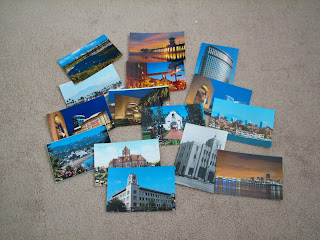
I have lived in Orange County for many decades and have several favorite buildings and areas I love. I searched for images of these areas on the web, and pulled out photos of my own. This photo shows some of the buildings and cityscapes I used to give me ideas for my design.

My next step was to meld these ideas together into one drawing. I made building cut outs and reduced/enlarged them on copy paper. I cut these out and then started to arrange and re-arrange them until I got a design that pleased me. The drawing below shows my intended design. It is a little heavy on the right side, so I intend to add more to the left side to balance it. But, its a good start and has most of the elements I want. On to the next step - enlarging the drawing to full size. Thank goodness for Fed Ex Office.


Thanks for visiting my blog!


Design Drawing

Sunday, May 5, 2013

Soul Food City - Serendipity Exchange

Soul Food City finished front
 
One of my favorite art quilt subjects are city-scapes, so I based my "feed the soul" themed piece on a location known for its soul food, New Orleans. I drew the city sky line, with some liberties taken, on a piece of purple fabric. The outlines of the buildings were machine stitched. I shaded the shadow side of the buildings with Inktense pencils.
 
The purple strip was placed on a mottled background fabric. I wanted to use colors that evoke the feeling of a city known for Mardi Gras.
 
I outlined some of the mottled shapes with thread painting to depict the puffy vaporous clouds that hang over the city.
 
Reflections of the buildings are shown in the water with thread painting as well. I liked the look of some of the raw edge threads hanging down so I left them there, using glue to help them stay in place. Some beads were also sewn along this thread line since this is a town known for beads at Mardi Gras. The edge was finished with couched yarn.
 
Some photos showing these details are below. I was shooting for a postcard kind of feel with the center section.

thread painting and threads hanging
You can see the beads above the threads in this photo.

clouds and yarn edging
Here is the puffy, vapor filled cloud shape, with echo quilting around it.

Thanks for visiting my blog!